Vert Blog
Confirmation Emails: 5 Simple Examples That Work

Confirmation emails, an often-overlooked component of email strategy, are automated emails sent immediately following sign-up. These emails allow a user to verify that they have opted-in to receive email communications from any brand, person, or event. Considering this email is generally the first impression in a user’s inbox, you would think it would be seen as an opportunity, however it is more commonly forgotten or considered a formality (or annoyance) for many brands.
The fact is, a user’s experience with a brand should extend to all communications, including a basic email confirmation. The email should match with the rest of the brand (or event), and should be designed to create a great first impression and a consistent user experience.
The five examples below are a few of the best confirmation emails out there, and should serve to fuel your future designs. They may even inspire you to rethink your current approach.
1. Mailchimp
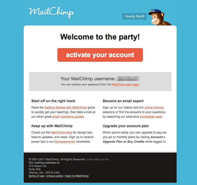
MailChimp has taken the concept of a ‘big red button’ for their call-to-action (CTA) quite literally. This large, clearly defined, easy-to-click button stands out as the most important part of the email. MailChimp has done a great job providing enough space between the button and supplementary content to avoid any distractions or clutter.
Distractions are the enemy of conversions. If you remove the distractions, it is easier to focus on the campaign goal. As a user, the button makes it pretty clear what will happen when you click it. Any button you add to an email (or landing page) should set the expectation for where it will lead or what it will do. The user should never be surprised or confused by what happens after they click a call-to-action (unless that surprise/confusion is intentional for the user experience.)
As you can see in the example, there are a few other actions you can take in the email, however none of these are in the form of buttons competing with the main goal of the campaign. The actions are all small text-based links that provide helpful advice and next steps specific to new users. When designing automated trigged emails, keep in mind where the user is in the process, what the next steps are, and what type of information would be helpful for them to proceed with.
Considering MailChimp is a widely used email service provider, and one of the most prominent supporters of double opt-in confirmation emails (as it requires it for almost all accounts), it makes sense that their confirmation email is branded and beautiful.
2. Pinterest
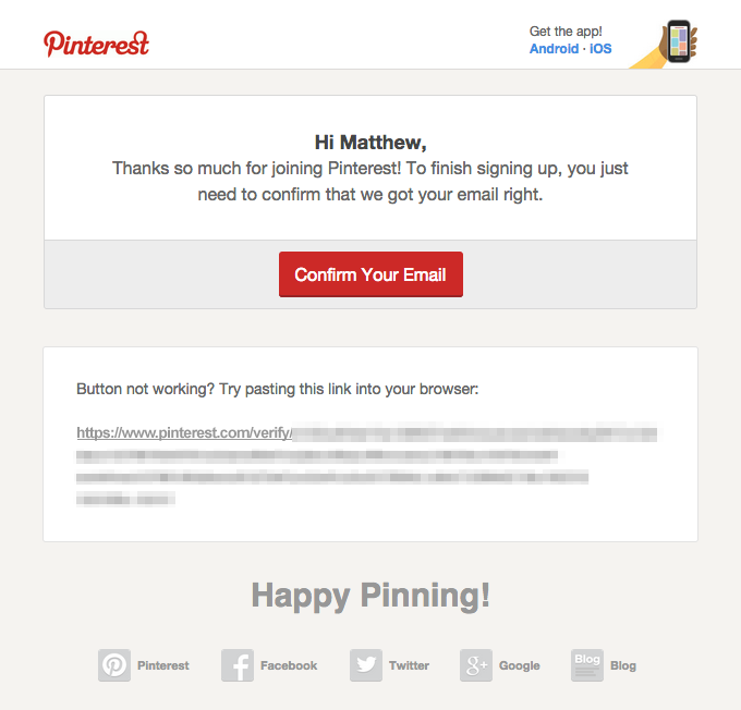
Similar to MailChimp, Pinterest chose to use a ‘big red button’ to allow the user to confirm their email, however they also included a secondary text link in case the button didn’t work for the user. Keep in mind that not every user has the same experience every time; sometimes things go wrong, whether it is user error, technology error, or in most cases the email marketer forgot to include the link (it happens).
Either way, whether it is your fault or not, anything that goes wrong is an opportunity to improve the user experience. This small but thoughtful addition from Pinterest helps ensure that their users have one less thing to worry about.
Pinterest also went with a more personalized feel by using the new users first name in the content. Personal touches in an email campaign can really make a difference, as long as it is done in good taste. You don’t want to be that creepy brand that watches your users every move and pops out of the shadows like “Hey Michael Gustaff Blane Jr., currently living at 259 Oakland Street, I noticed you were looking for underwear the other day and thought you might like these…”.
3. Medium
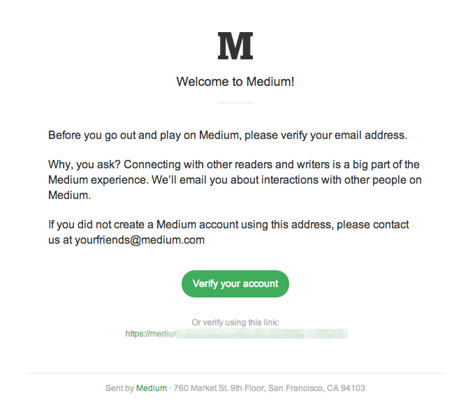
This example is all about simplicity and utilizing your brand’s personality and style to your advantage. The style of the email is certainly on-brand for Medium: clean, simple, and text-focused. The content makes it clear why it is important for you to verify your account, and what type of communications you will be receiving in the future once you do.
You don’t need a fancy design with a huge header image to make a great email. Stick with something simple and focus on the basics. Once you’ve nailed that down you can try adding other elements to the design. (I bet you the simpler design wins 90% of the time.)
4. Pottermore
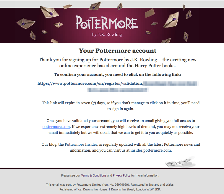
Yep, I’m a dork. I signed up for Pottermore — shout out to all my fellow Gryffindors! More importantly, this is a great example of a simple text link confirmation email. Even without a large button, the main focus of the email is still centered on the action of verifying your account. The best part about this email is that Pottermore is very transparent, which builds trust and credibility. They let you know what will happen after you confirm your account, what you may experience, and where to find information if you need additional help.
Creating a great user experience is about being helpful, and again, understanding that sometimes things go wrong.
5. Zulily
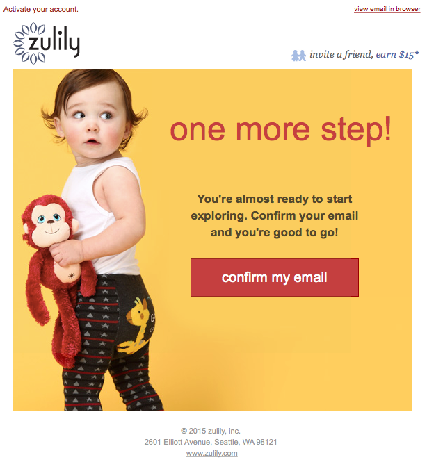
Zulily cleverly chose to use this first email interaction as an opportunity to gain even more subscribers. They got into the mindset of a user and figured, hey, if a person is signing up to receive emails from us, they must really like what we are offering. I bet if we give them a small incentive to share their love now we could generate even more traffic.
This type of lead generation has been very popular in the past few years, and has even been used by Pinterest, Dropbox, Nextdoor, and other successful startups to quickly grow users. It is especially useful for social networks, job search sites, for example, when the experience of a website or application requires a mass of users and user-generated content to be successful.
Note that the theory behind the ‘big red button’ doesn’t mean that your button has to be red. Or even very large. It simply has to stand out amidst the rest of the content, attract the eye, and make it clear to the user what action they should take next.
What are some of your favorite design-inspired emails? Do you think you know of a better confirmation email? Reach out to me via Twitter and let me know.